For a trading company to be successful, not only competent organization of the work of employees and a clear management scheme are necessary. Equally important is the appearance of the point. Consider the rules for window dressing. 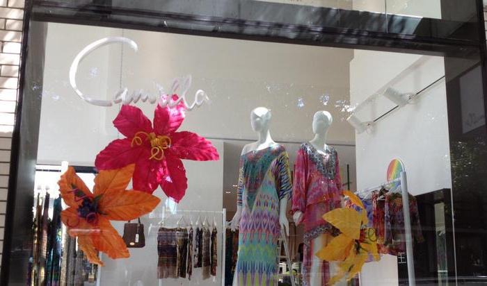
Availability
There is a well-established opinion that "purchasing power" is determined by a person’s long arm. This means that the product on display should be accessible to people. At the same time, the different growth of buyers should be taken into account. Carrying out the design of shop windows, the goods must be positioned so that a person can easily take or see it.
Rubrication
It is especially important when window dressing in a pharmacy is carried out. For each shelf, you need to make rubrics that are easy to read and made in the same style. The text should be clear to the average buyer who is not familiar with professional terms. Proper window dressing in a pharmacy will make it easier for consumers to choose. It is necessary to make sure that the visitor can navigate and find the product he needs. It is not recommended to use complex names of drugs ("Sorbents", "Hepatoprotectors" and so on) in the rubricator, as well as simplified names ("From lice", "From constipation" and others). The most optimal sections are:
- "Anti-inflammatory."
- "Painkillers."
- "Medicinal herbs", etc.
Also, window dressing can be supplemented with interesting sections:
- "Women's Health".
- "Medicines on the road" and so on.
Product Location
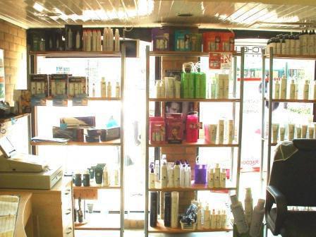
You can increase sales by placing the product next to the heading. If you pay attention to window dressing of grocery stores, it can be noted that well-known products are located next to the name. This significantly increases the likelihood of its acquisition. This rule can be applied to goods that are placed on shelves far from the eyes. The location of running products from a certain category next to the less well-known will attract the attention of the buyer to the latter. It is also relevant for the promotion of new products.
Mass display
This is how the window dressing is carried out in open spots. With a mass display, buyers have a feeling that a particular product is in high demand. In addition, there are associations with the affordable cost of products. The more space will be given to the product, the more it will be noticeable and attractive to the consumer. In closed points, window dressing can be done using double-faceting. Sales increase in proportion to the number of front parts visible at the same time. If you put the packaging of one product in two different versions, then sales will grow by 15%, three - by 30%, four - by 60%. These figures are conditional, they may vary depending on specific conditions. 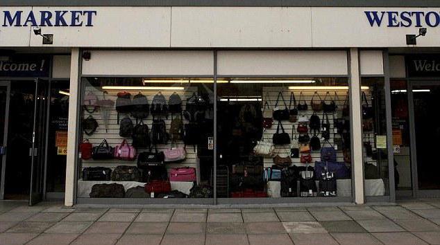
FIFO
This rule literally means "first come - first and must leave." FIFO stands for FirstIn - FirstOut. In accordance with it, the product that came to the store first should be the first and sold. If the window dressing is open, then the "old" products are located in front of the "new". This will reduce the costs of the company with expired products.
Fullness
With an open form of sales of goods, this principle is of great importance. The fact is that maximum product turnover can be achieved only when all the shelves are full. Empty space in the window forms a negative impression on the consumer. The buyer may think that he did not have time, there were few goods, and he ended and so on.This, in turn, will affect his desire to come to the store again. 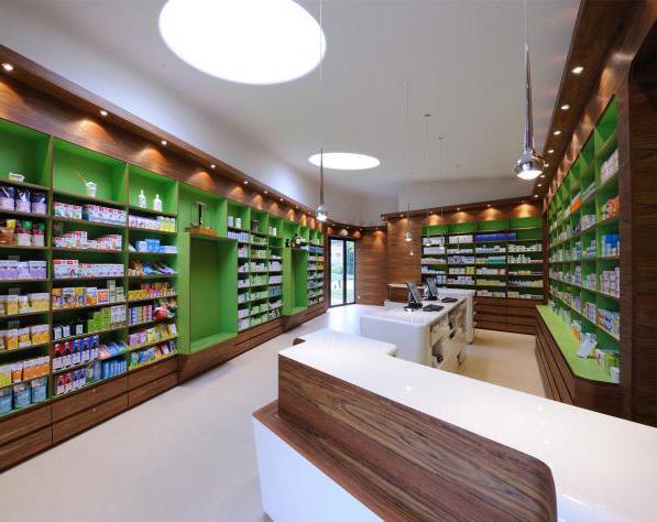
Price tags
The cost of goods acts as one of the main criteria for the selection of products. The consumer may well leave the store if he does not have a clear idea of the price of the goods. Cost must be marked so that it is clearly visible to visitors. To avoid confusion and misunderstanding, price tags should be arranged so that it is clear what products they belong to. Carrying out window dressing, one should not place two packages from one product with different cost. In addition, price tags should not cover the name of the product. For convenience, you can use special holders made of plastic. They are attached to the front of the windows. Bright signs (yellow or red) of unusual shapes are also often used. They attract the attention of customers and highlight the product for which, for example, an advertising campaign is being conducted. 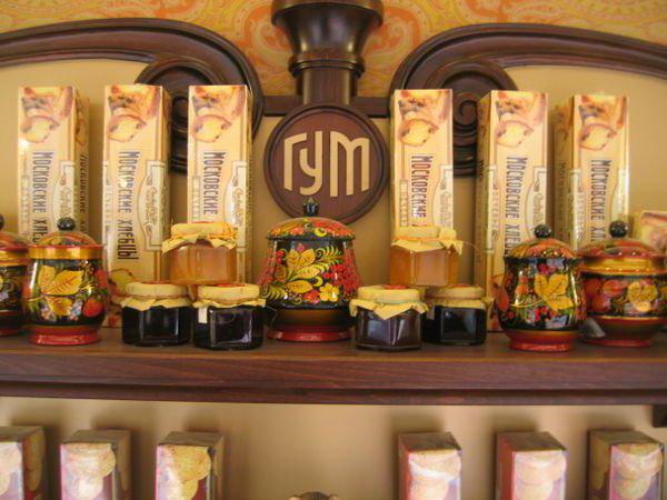
Backlight
You should be careful with this element. Properly executed lighting can effectively highlight a specific product in a window, attract the attention of visitors to a not very successful place in the hall. At the same time, it should not blind the buyer. He should be able to clearly see the product, name and value. You can position the light sources in different parts of the window. If the lighting is behind the product, it will drown out the volume and soften the color differences of the packages. Side lighting will create a slightly different effect. Lighting from the side will increase volume and emphasize vertical lines. When choosing a side illumination, it should be noted that goods in high packages should not be placed at the edges of the windows. Otherwise, they will close the light sources. When the lighting is located below and above, the horizontal edges become clearer. When installing the backlight, it is important that it does not damage the packaging. Incorrectly selected light bulbs or equipment can, for example, cause the boxes to melt. This will not only adversely affect the appearance of the package, but may adversely affect consumer properties goods. 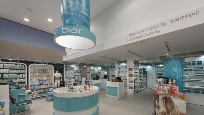
Conclusion
Window dressing is a very responsible occupation. With the correct implementation of this work, you can not only increase sales, but also transform the hall. However, there should be a measure in everything. This applies, in particular, to the selection of price tags, highlighting, and the location of products. Too many bright signs can irritate your eyesight. Such price tags are effectively used for specific products, and not for all products at once. As for the location of the goods, here, too, should be observed measure. It was said above that empty spaces on shelves can repel visitors. Buyers may also not like excessive piling up of goods. Products should be placed evenly. If the trading floor is large and there are many storefronts with goods in it, then for their design it is advisable to contact specialists. Today, quite a lot of companies provide this kind of service.


